


It’s always nice to remind yourself of where you’ve come from, right? I thought I would put together a post of how far my blog has come from in terms of design, content and growth that it’s been through. Read on for the evolution of shanylou! I must admit that my blog is still quite small in terms of followers, monthly page views and all the other stats but it really has grown from when I first started typing out my first post.

THE EVOLUTION OF SHANYLOU // HOW MY BLOG HAS PROGRESSED
My blog was originally hosted on Blogger, which is a holy grail to anyone first starting a blog. It’s very simple to use, doesn’t require much tech based knowledge and it’s free as well, which is always a bonus. My design and theme to my blog didn’t really have much thought into it, it was just about what was cute and pretty. I didn’t think about colour schemes, fonts or layouts and what they mean, but that always comes with growth.

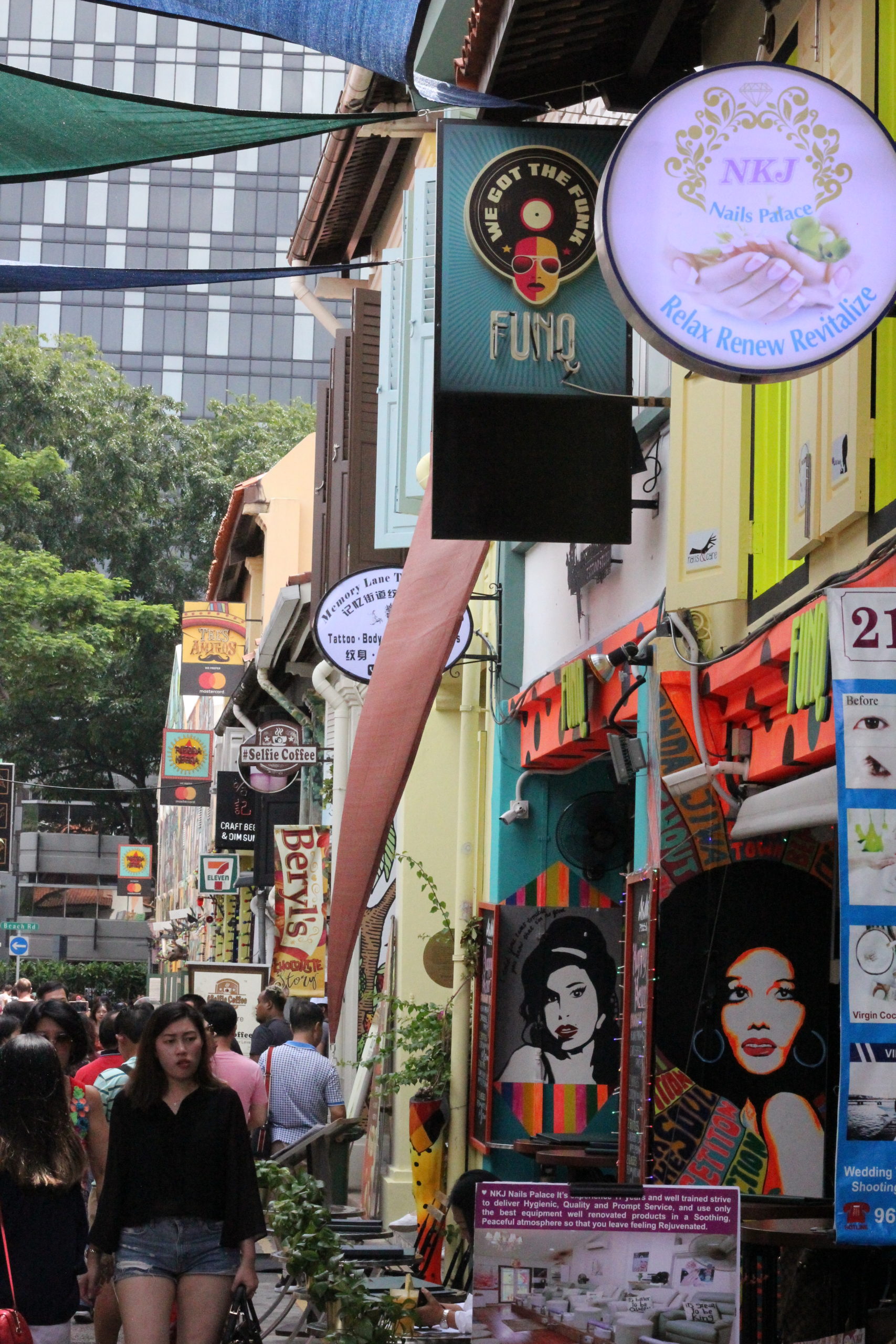
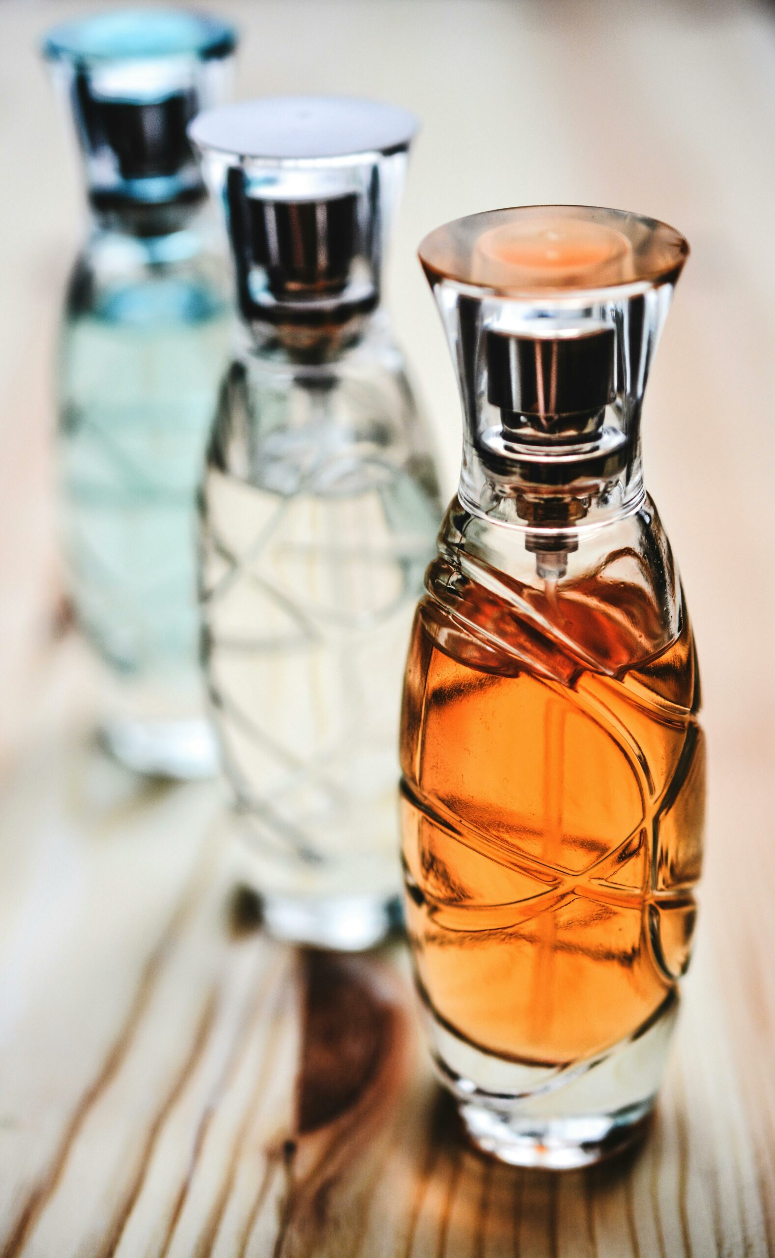
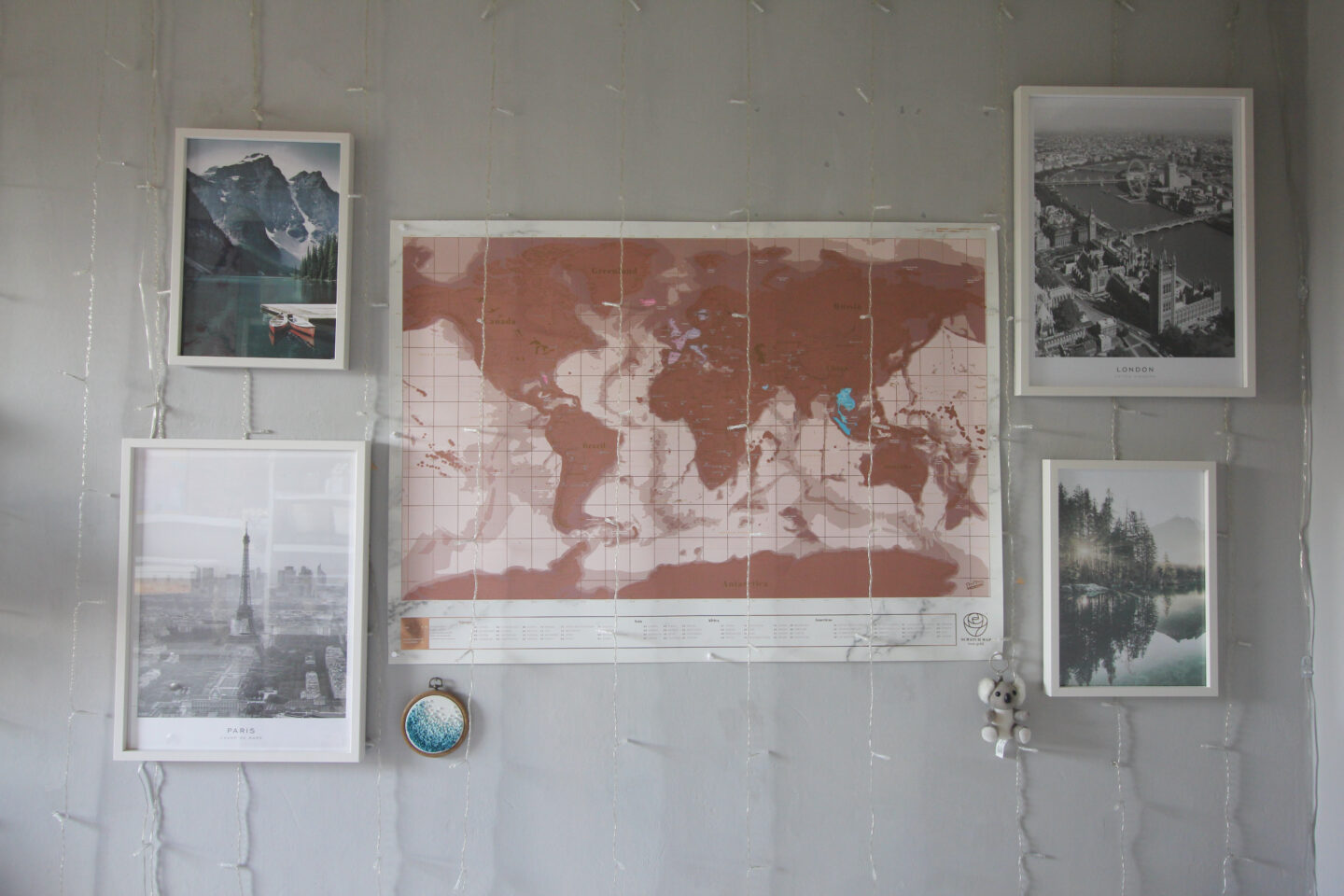
As you can see in the picture above, how terrible my blog was. I had no idea what I was doing in terms of designing it, I just wanted it to look cute and plus Blogger has very limited design and layout capabilities. My main content focus was cute and anime related things because at the time I was a student only earning some money at my weekend job and was into anime and cosplay. I was writing about my budget friendly finds when it came to makeup, accessories and fashion.
When I finally got a full time job after leaving school, I was able to save up and pay for a blog migration to WordPress and pay for a web designer to create me a logo that was more my theme and design. I bought a theme from Etsy and installed it onto my WordPress blog.
READ MORE: The Rebrand of shanylou: A New Look 1.0

This was the theme that I purchased from Etsy, which was a little more what I was going for at the time and the logo my designer Giada from MielCafeDesign created for me. I have worked with Giada several times over the years as she understands my vision and design preferences so well. When we created my first blog logo/header, we went for a girly and relaxed vibe with the colours chosen and the watercolour theme throughout the blog name wording and the illustrations around the wording.
The same colour scheme and design was implemented throughout my business cards, which she also designed with me. I had originally used a random template and design on Vistaprint which did not go with my blog theme at all, so I’m really glad Giada was able to fix that for me as well.
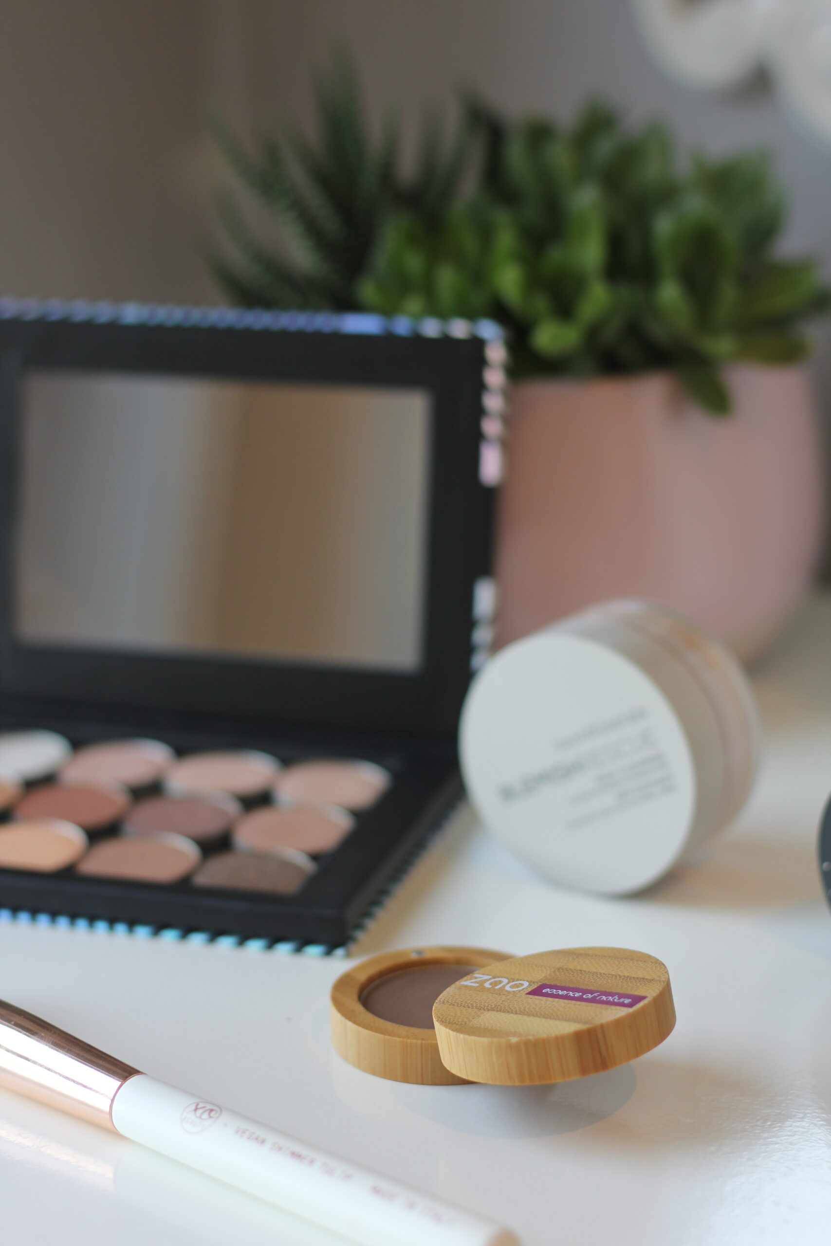
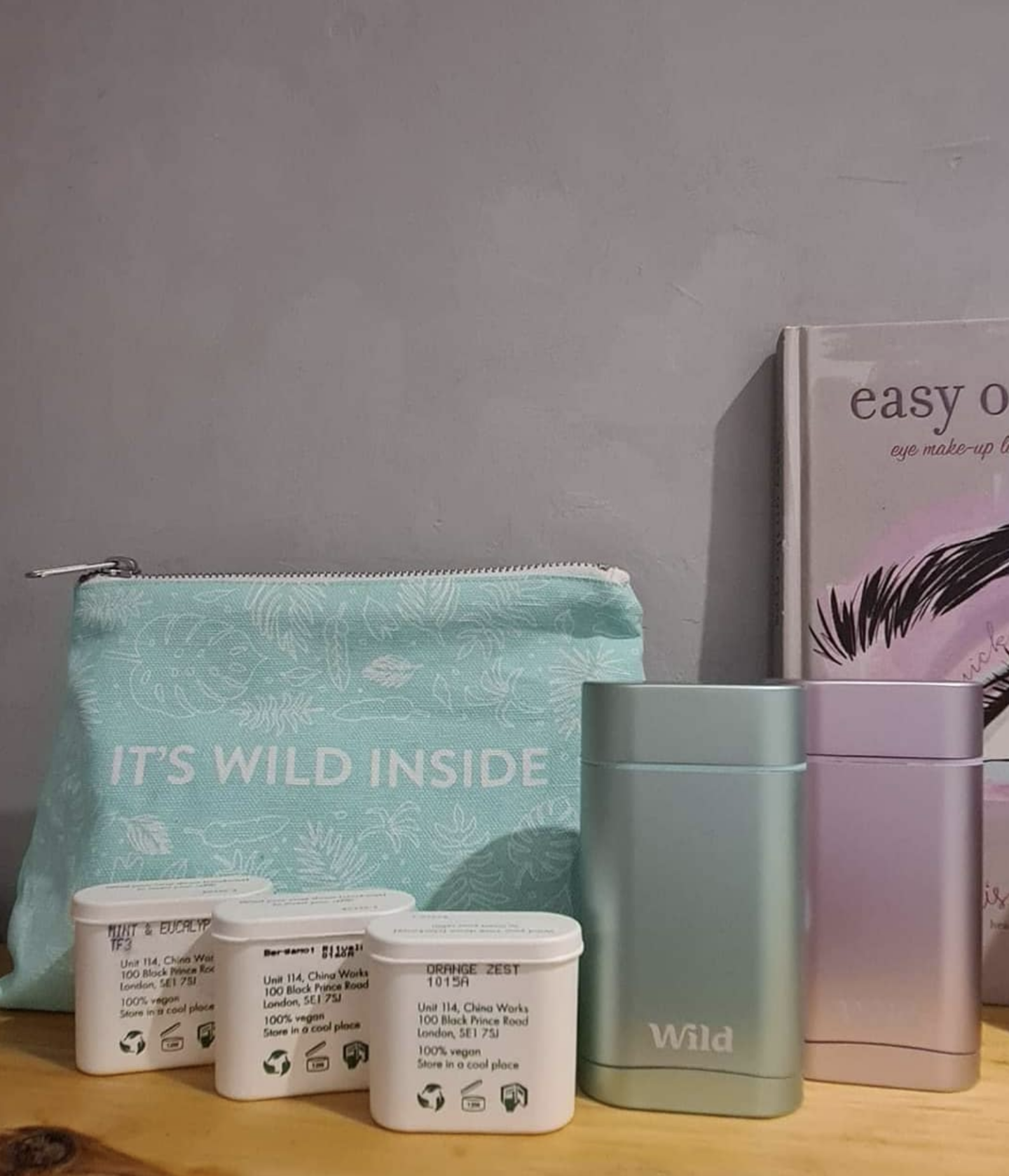
in 2016, my content focus was still on budget friendly topics but more so on lifestyle and cruelty free beauty. I was delving more into cruelty free brands rather than ones that were more popular and my views on purchasing beauty products changed a lot.


My business card design glow up
READ MORE: Designing My Business Cards With Giada

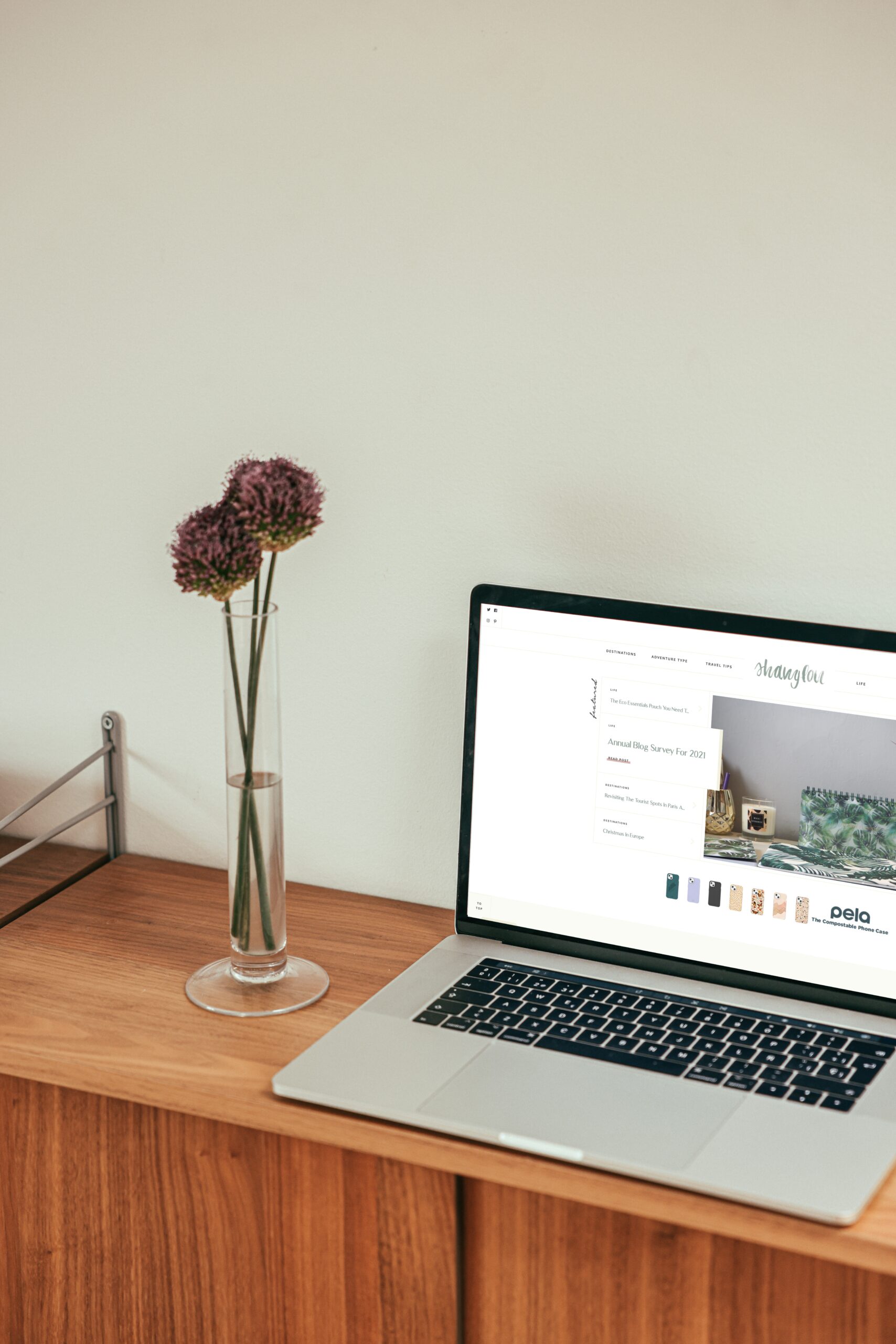
In 2018, I was actually able to ask Giada to create my blog design for me from scratch. This way I could implement features and functions into the design that would benefit my readers a lot more including a destination map in the Travel section of the blog and lots of custom post designs that would add more interest into the readers experience.
I didn’t have this design very long, as a year later I was in contact with Giada again to change up my design one more time. This time I was wanting a more perfected look when it came to my blog design and a lot more interesting features and design aspects to keep you as the reader interested in using my blog.
I wanted interactive dropdown navigation menus, illustration themed category headings, neater post layouts and a travel map to help you navigate by country.

There are a few more tweaks I’d like to make in the years to come to improve things slightly but nothing major. I ideally want to change up the Destinations page and make the navigation to blog posts about a particular country a lot easier and have a Travel Guide page about each continent rather than each country and make it a lot more streamlined.
I’m sure more changes and improvements to my website are to come to improve your experience and enjoyment of visiting my site. Let me know if here is anything you would like to see and change in the comments below or by taking part in my quick 5 minute survey.
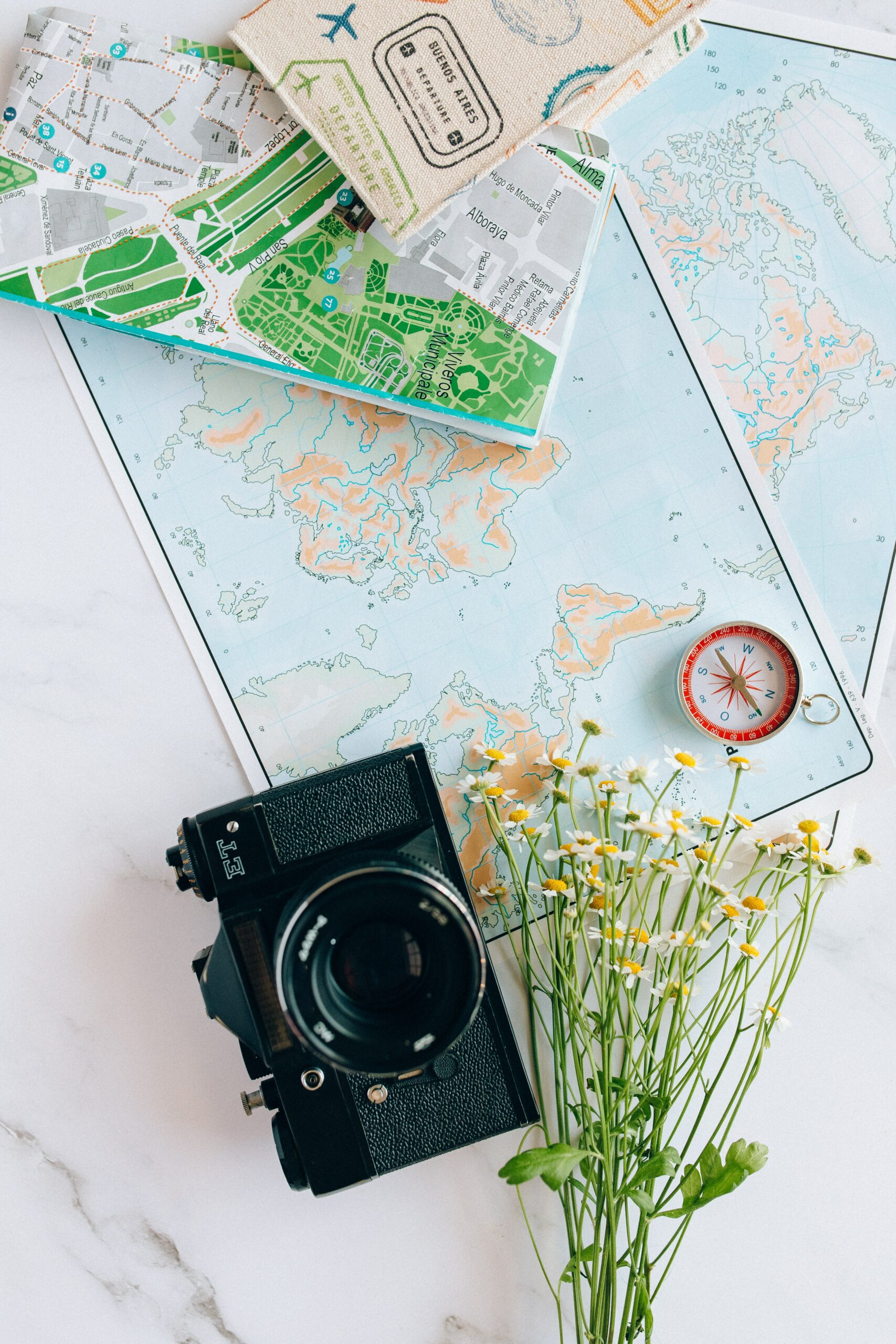
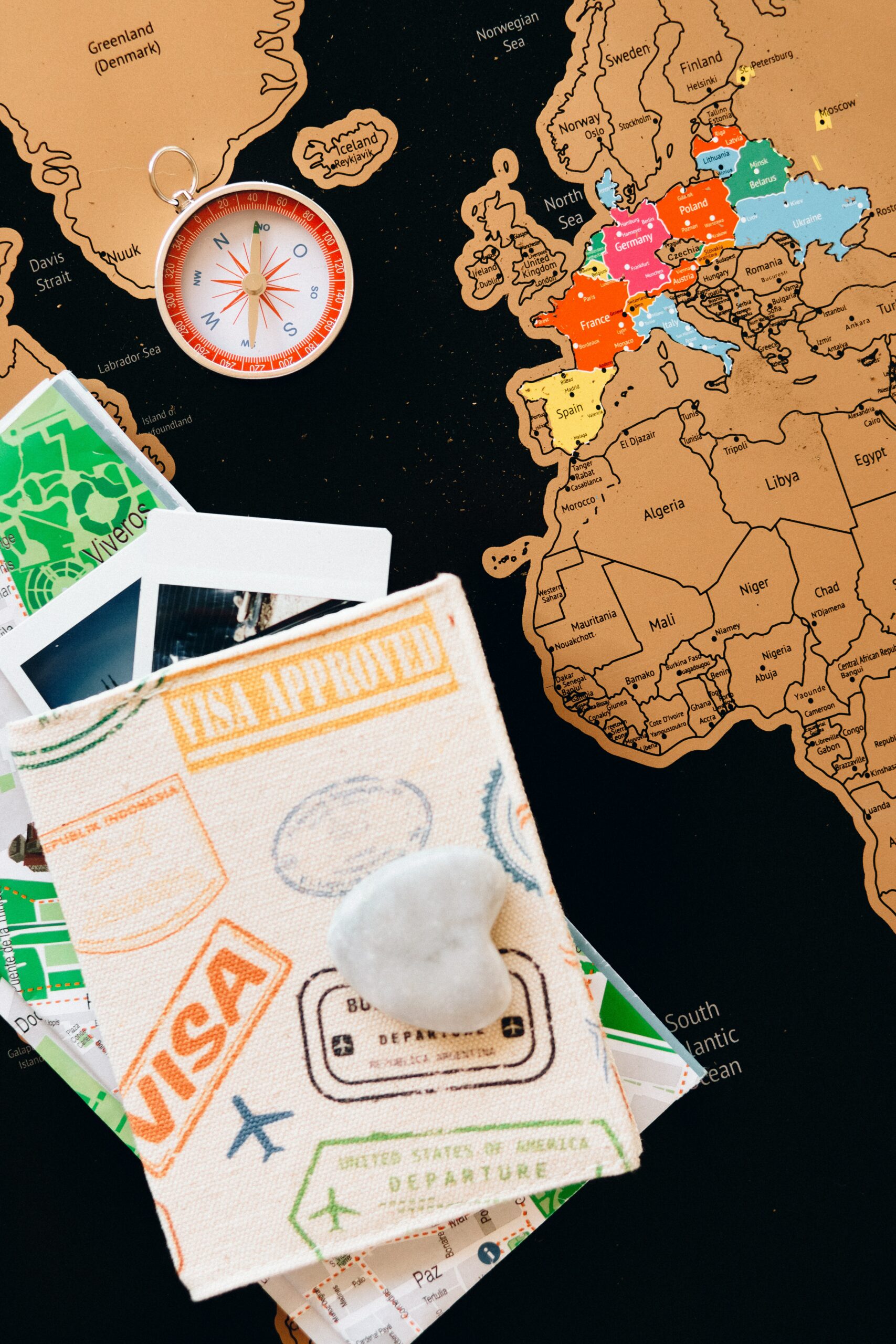
Images used in this post are credit to Adrienne Andersen and Cup of Couple on Pexels.
SHARE THIS POST AND GIVE IT SOME LOVE !!


Has your website or blog gone through major changes? Let me know your thoughts of my upgrades in the comments below.
Be kind,


0 Comments