


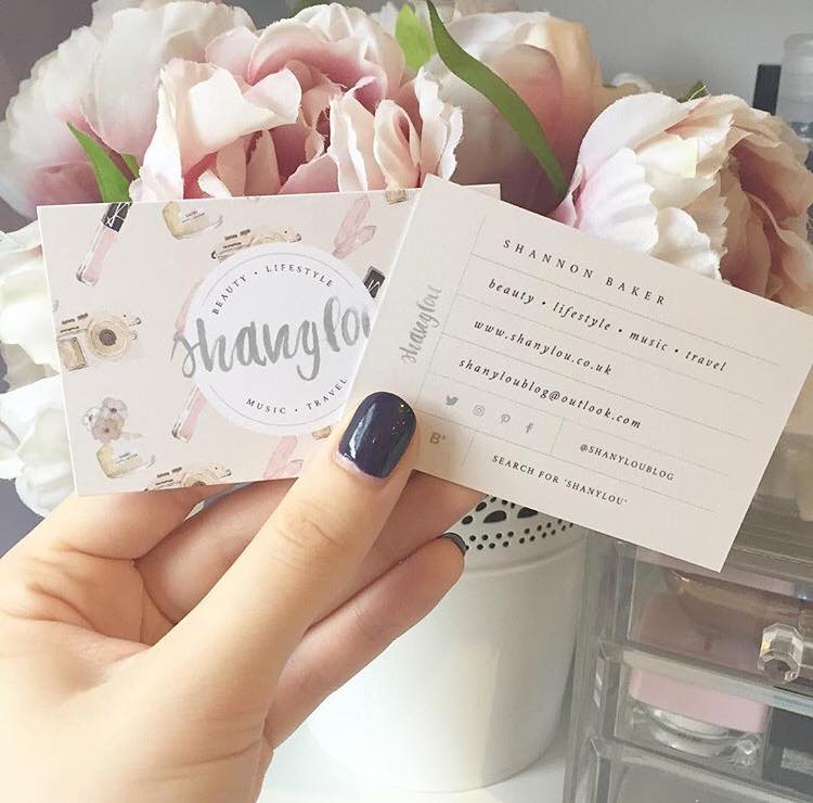
She’s back with a new look! I am so excited to reveal to you guys my blogs brand new look. I have been working with my lovely friend Giada who I’ve been working with over the last month or so creating my blogs new look. You may have seen her previous work with me working on my blogs logo and business cards.
I couldn’t wait to get back working with her to completely finish my blogs revamp and makeover. She had done such a good job. With my blogs header and business card design that I wanted to use her again. This time for my blogs main design and she also knew what I was after for the whole look. Something clean, girly and pretty.
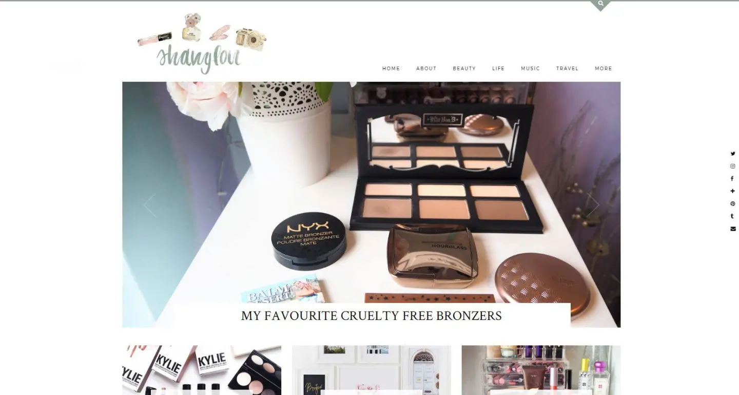
A NEW LOOK FOR SHANYLOU
We started with a questionnaire to gather all the information she needed. This was to help understand what I was after with my blog design. And when the start date hit – we got to work. We started off working on the fonts I wanted to use on my blog which featured 3 main fonts.
1 for the main body text, 1 for main titles and a more romantic calligraphy style font for details. Whilst I was waiting for the start date to come, I spent the time to do some research. Then to find different layouts and features. Gathering inspiration from other blogs and websites that I liked for features in my new blog layout.
When I had found ones I liked I added them to our joint Pinterest board. As well as different blog media pack designs that I liked as I’ve asked Giada to design my blog media pack. She compiled together 3 sets of different fonts going by the information I gave her in the questionnaire.
I was able to mix and put together to choose the 3 fonts I wanted for my blog. Once I had chosen the 3 different fonts in their sample paragraphs, we then moved on to the homepage. Which she put together some of the features I wanted on the main homepage.
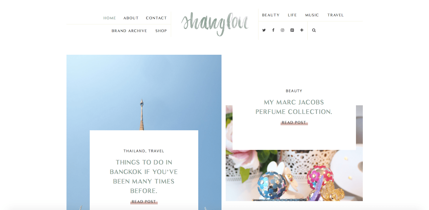
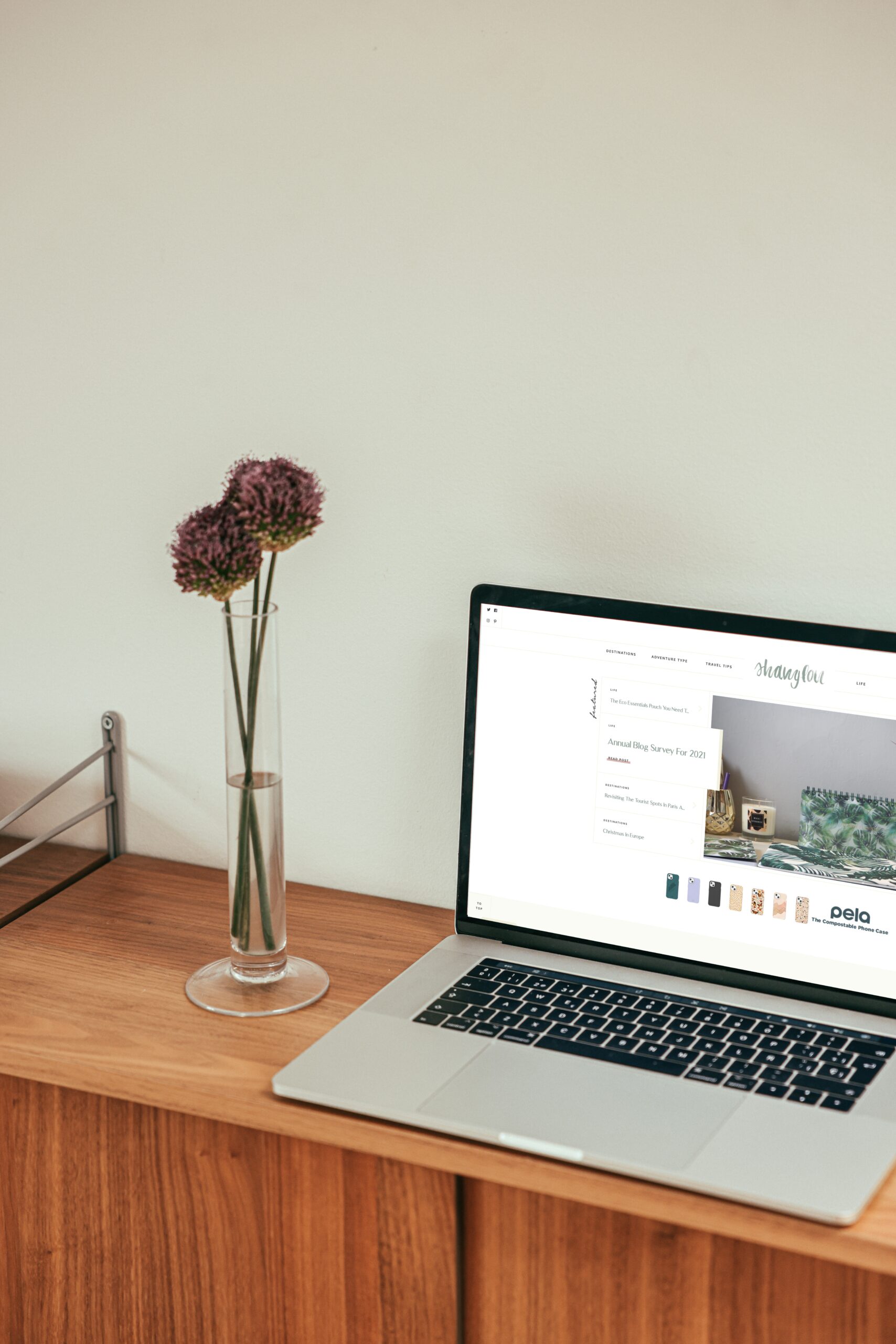
A few days went past and I had another exciting email from Giada. Attached was the preview to my homepage and I was so happy with it because it featured so much. It looked so pretty and featured a lot of what I wanted. I love the detailed calligraphy font I chose for detailing and the new format of my latest blog posts. I went back to Giada and expressed my love for the new homepage. Giada then got to work on the rest including the category and static pages.
She then sent me over the other pages previews of what they would look like. We also worked on the travel category which includes an interactive map, shop widget and a navigation section. For readers to search via country which links to all of my blog posts.
Once she had sent me all of the previews, Giada had started to put together the live preview for me to look at. As well as tweaking bits here and there until it was ready to make the new design live. We also worked on the mobile view and how I wanted things to look on there as well. So it would be suitable for all mobile phones and tablets.
As we worked on the post style formats that I wanted. We also put together some image formats that I really liked. Those I wanted to include in my blog posts. The 3 formats we have put together are two images overlaying each other, text and image column and two portrait image columns. These you will see used throughout my posts.


My Travel category is also one thing that I wanted to improve and make better as I do write quite a lot of travel content. I wanted to add an interactive map to show all the countries I have visited which you can also click on and it will take you to the posts I have written about particular countries on.
I also have my travel shop widget which you can shop my favourite travel picks and you can also click on the countries name and browse posts that way as well.


Each category also has it’s own designed illustration (which have been used on my business cards) which is located at the top of the page. I also have a new layout for blog posts which I really wanted them to be portrait and so you can see them neatly on the page.
I also have a few other features which I’ve highlighted in my most recent post, which was all about GDPR and the features my blog now includes to cover that. My new blog design is also mobile and tablet responsive so you can easily read my blog on the go too!

Now my new blog design is live and for everyone to explore and love, we will now be working together to create my press/media pack for companies to download when they want to work with me.
We will incorporate the same colour scheme and designs into the media pack as we have the blog design, header and business card design, so they all tie in together. Please leave me a comment below and let me know what you think of the new design. I hope you enjoy the new look and continue to support me and my blog.
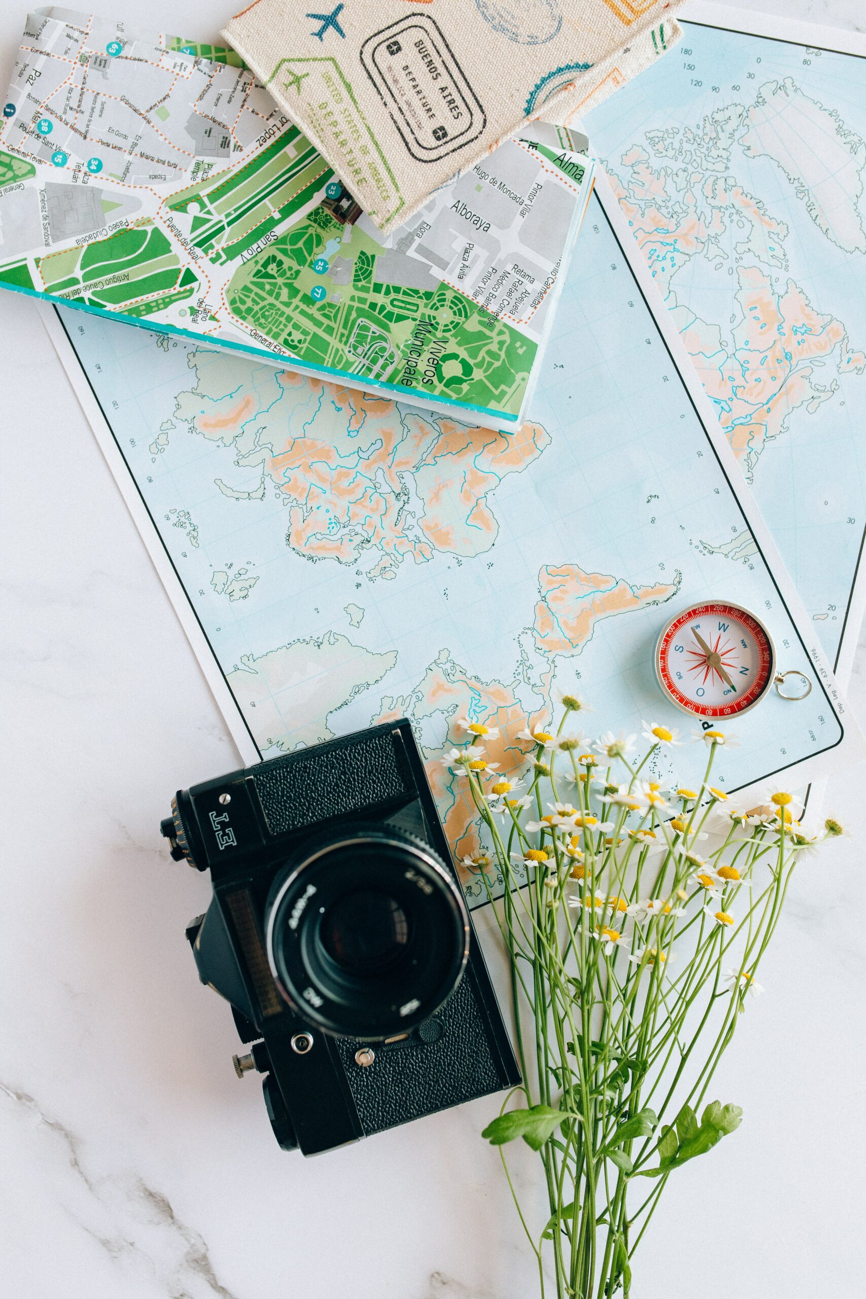
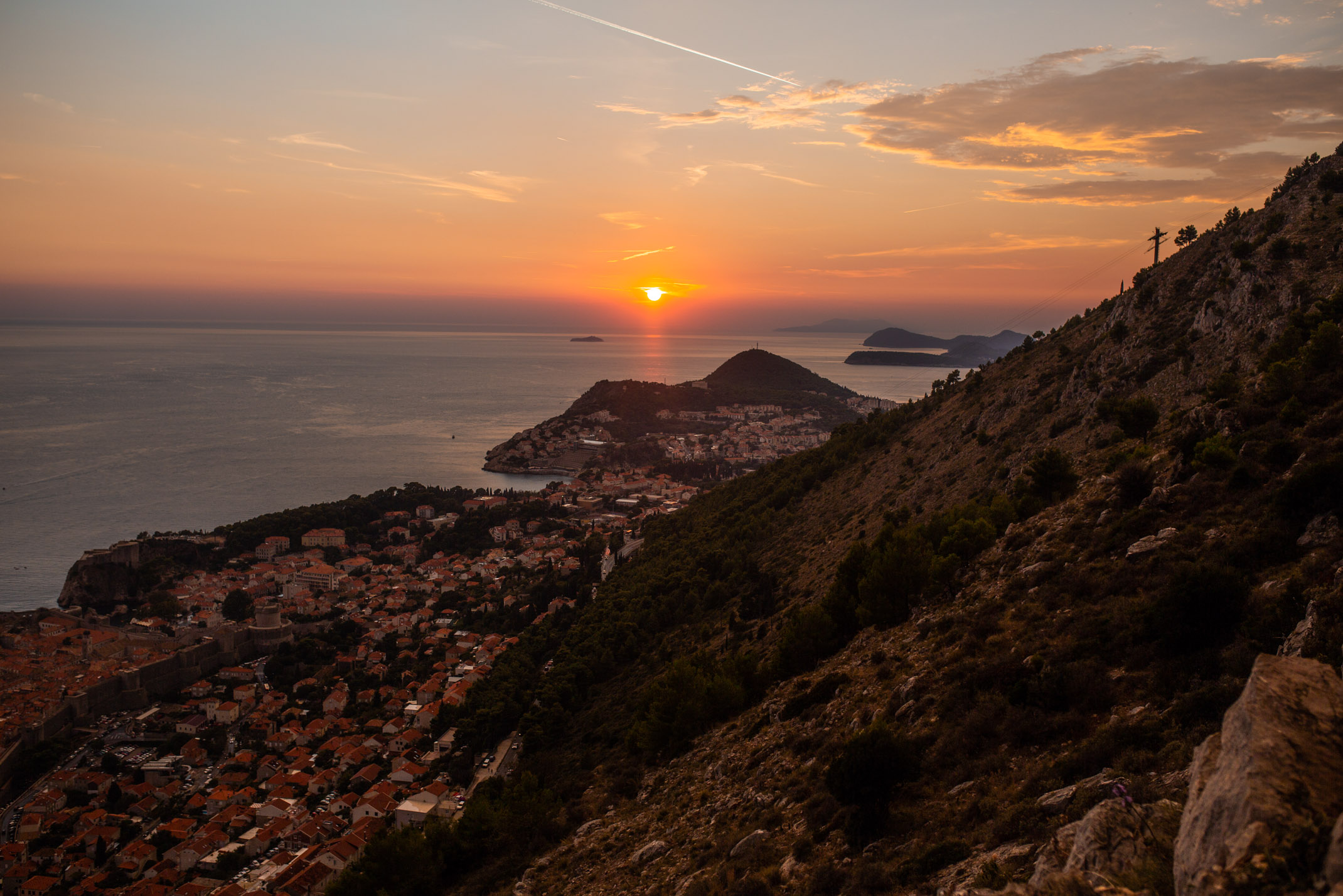
Image used in this post is credit to Lukas on Pexels.
What’s your favourite feature of the new design?


0 Comments